The Foundations of Visual Language
Think of the principles of Graphic Design as a universal set of rules and guidelines that help to organise the visual elements within a composition. Their aim is to ensure the message lands effectively with its audience by using resources like colour, shape, space, and layout.
In the same way that grammar gives structure to the written word, these principles give structure to our visual language. This allows anyone, regardless of their prior experience, to put together visual pieces that are both coherent and appealing. They aren’t rigid, unbreakable laws, but rather flexible guidelines that help you arrange visual elements in a truly effective way.

7 Principles of Graphic Design
Now that we appreciate their importance, let’s break down the ingredients in this recipe for visual success. Each of these principles plays a vital part in the final result.
1. Alignment: Guiding the Viewer's Gaze
Alignment is all about placing elements so that a visual connection exists between them. It makes the design easier to read and understand, bringing a sense of order that allows the viewer’s eye to travel naturally across the composition. Imagine a restaurant menu where the prices were all over the place instead of being lined up with the dishes. Aligning them creates a clean, crisp visual link, getting rid of any sense of clutter.
2. Contrast: Playing with Difference
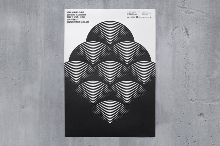
When it comes to making an impact, contrast is your best mate. It’s created when two elements are clear opposites: big against small, light against dark, a chunky typeface next to a delicate one. Contrast is used to draw attention to specific elements and to highlight key differences. A simple example is the use of opposing colours, like the black on white in the SHIFTA by Elisava logo. This not only boosts readability but also adds real emotional punch.
3. Repetition: Using Patterns to Build Your Identity
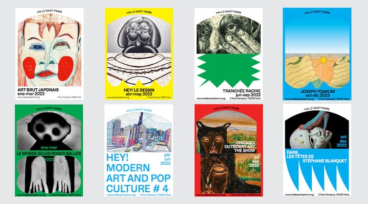
Repetition is about creating consistency and a sense of unity. It involves using the same colours, fonts, or shapes throughout a design to reinforce its identity and tie the whole composition together. Think of a brand that always uses the same colour palette and typefaces. That repetition builds instant recognition and lends a professional, polished feel to the work.
4. Proximity: Grouping to Avoid Chaos
This principle is rooted in simple human logic: we tend to see items that are close to each other as a group. In design, proximity is used to organise information and create clarity. It’s a bit like seating family members together at a wedding to make conversation easier. A title, its subtitle, and the corresponding paragraph should all be placed close together so the viewer immediately understands they belong to the same block of content. Grouping related elements makes things clearer and cuts down on visual noise.
5. Hierarchy: Putting Information in Order
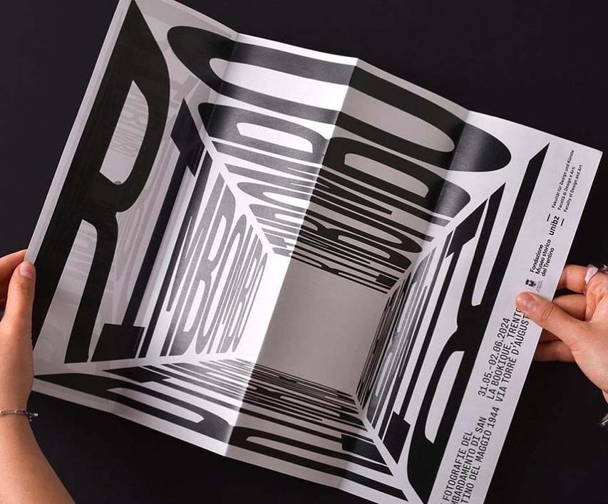
Not every element in a design carries the same weight. Visual hierarchy is about guiding the viewer’s eye through the content in a specific order, from the most important to the least. You can achieve this through size (a larger headline), colour (a more striking shade), or position (we tend to see what’s at the top first). The title of a poster, for instance, must be bigger than the rest of the text to grab attention straight away. Good hierarchy ensures your main message is understood at a glance.
6. Balance: Finding Harmony and Stability
Balance refers to the distribution of the visual weight of objects, colours, and space in your design. Like a well-balanced set of scales, it ensures the composition feels stable and harmonious. Balance can be symmetrical (a mirror image), asymmetrical (more like an abstract painting), or radial (like the petals of a flower).
7. Rhythm: The Pulse of Your Composition
Rhythm in design is like the beat in a piece of music. It’s created by repeating elements—lines, shapes, colours—in a way that builds a sense of movement and guides the eye through the work. It can be regular and predictable or varied and dynamic, but it always helps the design to flow.

How to Master Them: From Theory to Practice
Learning the principles of Graphic Design is just the first step. The real challenge is putting them into practice. Before you begin any project, define what you want to communicate and set a clear objective. This will help you apply the principles in a coherent and effective manner.
Don’t just settle for your first idea. Experiment with alignment, play with contrast, and adjust the hierarchy until you find the best visual solution. When you think you’ve nailed it, show your designs to others and listen to their feedback. Getting input from your peers and learning to take constructive criticism on board is essential for growing as a designer. Knowing the principles of Graphic Design is fundamental, but true mastery comes from practice and expert guidance. They are what separates an amateur design from one that truly communicates, persuades, and inspires.


