The Disfluency Hypothesis
Through seven chapters, completed with glossary and bibliography, Dyson delves into all the relevant aspects of legibility, from the nature of the support (screen or paper) and presence/absence of serifs to line spacing and layout. Moreover, the professor evaluates the methods used in numerous research studies and reminds us that here two fields need to find common ground (chapter 3, section “Design perspective”): “Designers often express dissatisfaction with certain aspects of empirical research, typically carried out by psychologists without consulting designers”.
This online book is important for many reasons, but a specific one stands out: a 2011 study concluded that hard-to-read fonts improved learning, and Dyson assesses that hypothesis in chapter 7, section “The case against legibility | disfluency”. She states that ulterior research has failed to replicate the results: “[D]isfluency effects are not robust (repeatable)” and “we don’t yet know the disfluent conditions which might help us remember what we have read”. Therefore:
I wouldn’t recommend using less legible material in your design practice, as we don’t have good evidence that there is an improvement in retention or recall. Although disfluency may sometimes have positive benefits, communicators and educators are advised to present information in a form that facilitates easy processing, promoting legibility.
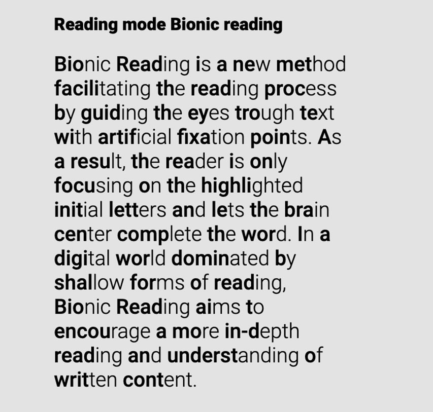
Bionic Reading
I would hugely enjoy reading Mary Dyson’s judgment of a new fashion in legibility: bionic reading. According to Renato Casutt, founder of Bionic Reading (with applications in every app store), setting in bold face one or more initial letters of every word (depending on its length) helps the brain. The emphasized letters create fixation points and guide the eyes, then the brain completes the rest of the word. The ‘About’ page reports that this method is supported by a 1980 study (“A theory of reading: From eye fixations to comprehension”, by Marcel A. Just and Patricia A. Carpenter, Psychological Review, 87(4), 329–354).

If anything, one would think that stylizing parts of words in bold can hinder the rhythm and length of the saccades (jumps) in reading. The most prominent paper to explain how eye movement works is Kevin Larson’s “The science of word recognition”, hosted in Microsoft’s website (2004). Dyson acknowledges the value of Larson’s article and reminds us of the following: “When we make these saccades, we position our eyes so that part of the text falls on the area of maximum acuity on our retina; this area is called the ‘fovea’”. What I ask Casutt, then, is: What makes you think that messing with the way our eyes function will produce reliable results? (Incidentally, another question regarding a piece of information given on the homepage: Having 882 million search results on TikTok proves what?).
Criticism of Bionic Reading
Fortunately, someone is already objecting: Addison Rizer published last year “Bionic reading: A new method for reading faster or just another gimmick?”. As for professor Dyson, in chapter 5, section “Type variants (bold and italic)”, she tackles the use of bold style. It is used in titles or to emphasize words. She says: “These differentiations can be regarded as ‘typographic cueing’, which can work as an isolation effect, setting apart some information and making it more likely to be noticed by readers”. Thus, setting the beginning of every word in bold seems a nasty way of meddling with the eye, the brain and even the information that the text is supposed to convey in a clear and efficient manner.
As a final note, last January David Březina and Mary Dyson came up with a new article on Design Regression, concerning a recurrent topic in legibility papers: «Can we selectively attend to the top halves of letters and ignore the bottom halves?». Let’s read!


